
 Russian
  中文
中文  العربي
  Bahasa Indonesia
 Market analysis using chart
Market analysis using a chart. Types and features of graphical display of quotes
Price charts are the tool without which the work of a trader is impossible to imagine. Even if a trader is trading on a glass of prices, or only on the news, he should still study the chart. According to the schedule, investors determine the likely levels at which the asset will be traded for a certain time, and speculators predict a decrease or increase in quotations. This article will discuss the most common types of charts that are operated by traders working with various groups of assets.
What does the graph show?
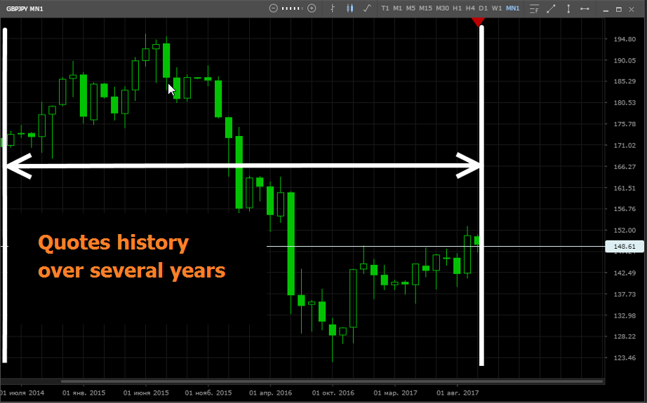
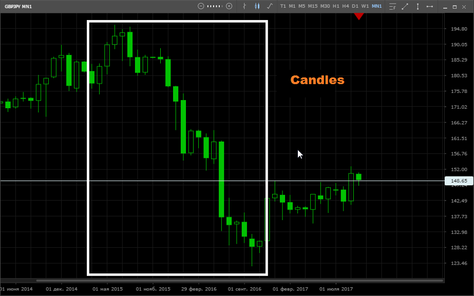
The graph shows the history of changes in the price of an asset. The graph shows the period of time during which the price rose and fell, and it is possible to find out what the market value of the asset was at a certain moment. The figure below shows the history of the price of the GBP / JPY currency pair for several years:
What is a chart timeframe?
Timeframe ”is a trading period, a time interval in which quotes are combined and formed into separate elements of the chart (bar, candle). That is, the whole history of price changes is “encrypted” in one candlestick - it can be seen where the price was at the beginning of the period, what was the maximum and minimum value of the price for this period, and what price was at the end of this period (candle closing).
Depending on the nature of our strategy, we have the opportunity to see how the market changed over several minutes, during the whole trading session, over a week, a month, a year or several years. At the top of the graph there are buttons with which you can change the time period in question:
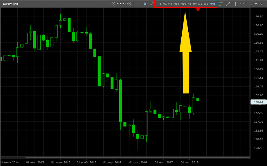
Most traders use standard time frames:
- T1 - tick chart, which shows the slightest price movement;
- M (1, 5, 15, 30) are minute time frames, where each figure (candle, line or bar) displays price changes for one minute, five, fifteen or 30 minutes;
- H (1, 4) are hourly time frames, on which each figure displays price changes within one or four hours;
- D1 - on this timeframe, each figure shows price changes during the day;
- W1 - each figure shows price changes per week;
- MN1 - each figure shows monthly price changes.
The display of the price chart (bars, candles, lines) can be configured so that it is convenient to study the changes that have occurred. Chart view switches are also located in the upper panel, to the left of the timeframe switches. Now we will consider in detail the types of graphs.
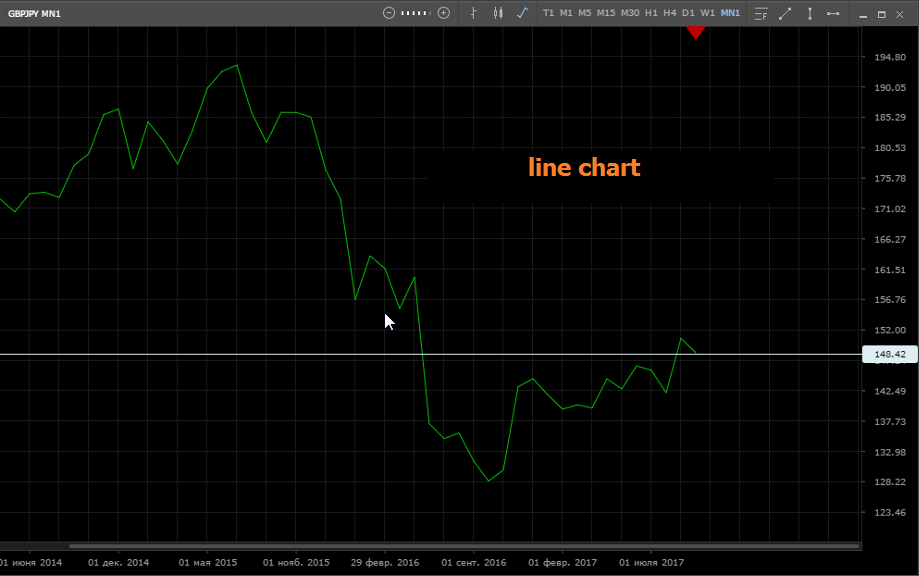
Line graph
Quotation changes on the chart are displayed as a solid line that connects the closing prices for each period (depending on the timeframe). However, the chart can be adjusted so that the line connects the open price or the average price between the open and close.
This is the least informative display option. But, at the same time, it is a very simple and intuitive option that allows you to clearly identify current trends, and therefore is great for beginner traders. Also, a long-term chart can be successfully used by long-term investors who rely mainly on fundamental factors (for them it does not determine which figures the price writes out).
Bars
Bars are figures that visually show how the price has changed over the considered time period, each bar provides information on four indicators at once:
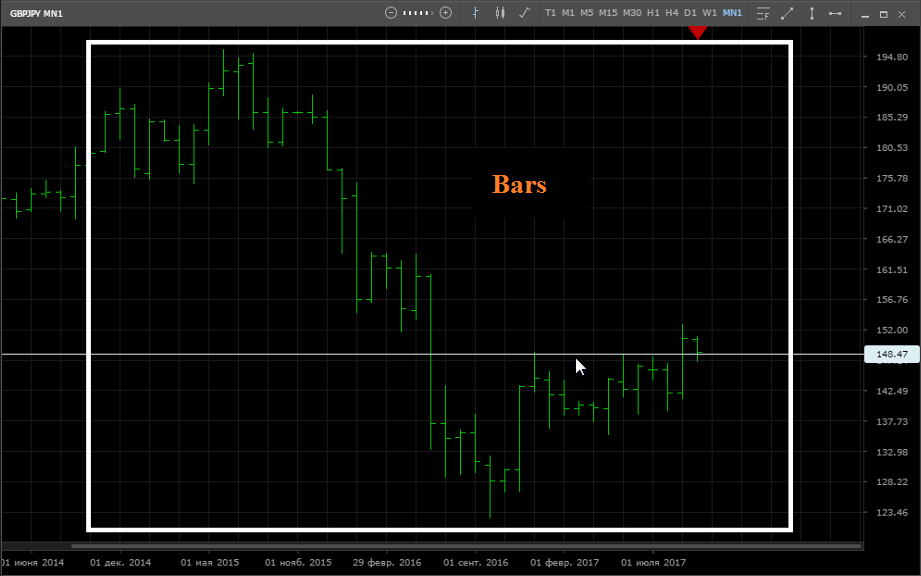
- Opening price (Open) - shows the value of the asset at the beginning of the period under review;
- Close Price (Close) - shows the value of the asset when closing the period;
- Maximum Price (High) - the highest price during the period;
- Lowest price (Low) - the lowest price during the period.
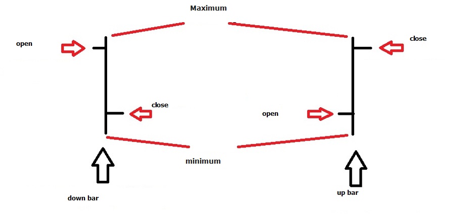
Japanese candles
Candles are figures that look slightly different and give the trader a little more information than the bars (and even more so than the line chart). In the structure of the candle, the “body” is distinguished - a rectangular colored area, and the “shadow” - thin vertical lines that are located above and below the “body” of the candle. In each candlestick, “body” means the distance from the opening price to the closing price, and the ends of the “shadow” - the minimum and maximum price of the asset for the selected period.
In addition, candles are colored in accordance with the direction that is dominant within the period under review. So, for example, if the closing price is above the opening price (upward movement) - the candle is colorless, and vice versa, if the closing price is lower than the opening price (downward movement) - the candle is painted in color (most often green). Here's how the candles look on the chart:
Tick chart
Each price movement (tick) is shown on the tick chart; these charts are used to very accurately find the entry point. This can be useful for speculators trading at ultrashort distances, and earning at very small price impulses. However, this is a somewhat specific type of trading, so we will talk about it in a separate article. Below is a tick chart:
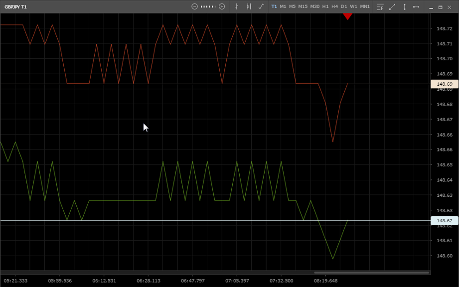
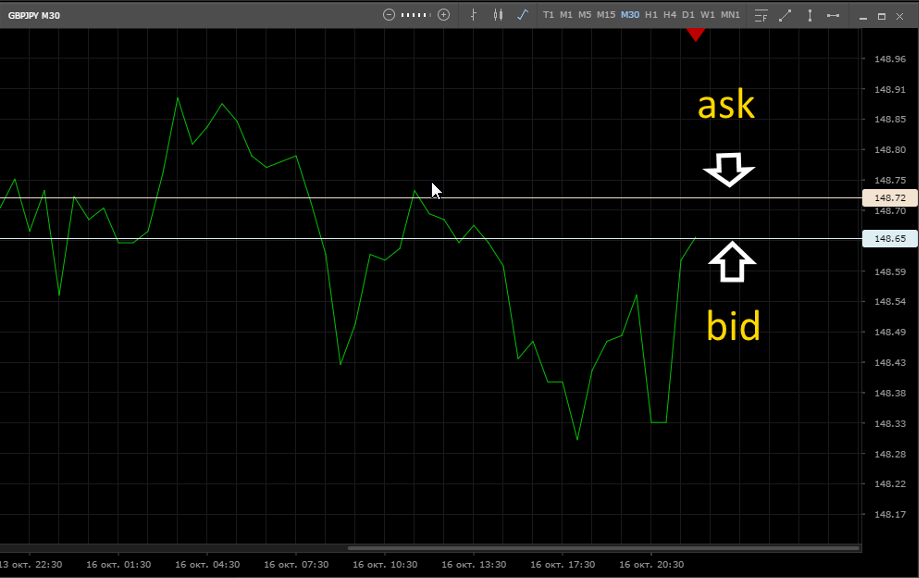
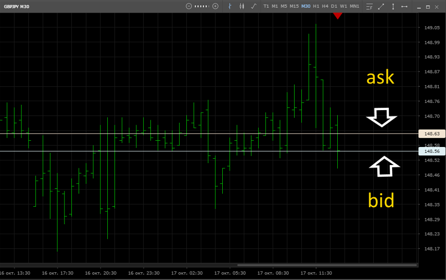
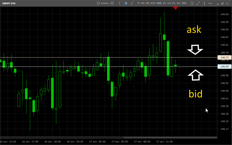
By default, the charts show the change in quotations at the bid price. However, the graph can also show the price of “Ask” and, these two prices can be displayed simultaneously. To change the display settings of the price, you need to hover over the chart and open the settings menu (right-click). The figures below illustrate how these prices are displayed on different types of charts:
Lines, candles or bars? How to use the chart for forecasting?
How can you use charts to determine the future price of an asset? After all, a chart can give information only about what happened earlier, as well as how the price changes at that moment. And why do you need all these bars, candles, lines and ticks?
There are so many strategies based on various theories of technical market analysis. The creators of such theories build on the idea of cyclicality and believe that many market situations are periodically repeated. Based on this, to date, many different patterns have been developed - graphic shapes that the price draws on the chart. And if a trader can distinguish between such figures, he, finding them, believes that there is a high probability of a situation developing according to a familiar scenario. And this probability gives him reason to enter the market.
Examples of patterns used on different types of charts
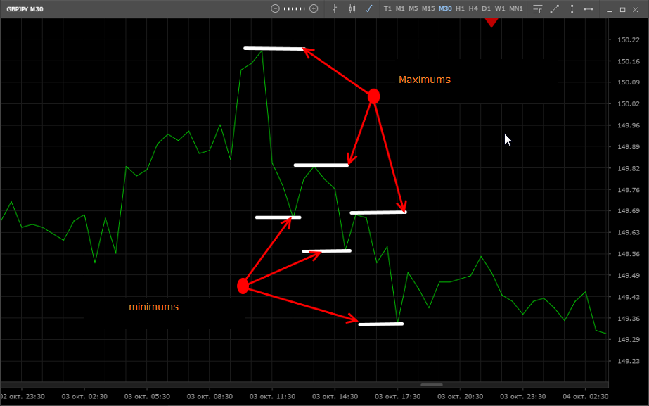
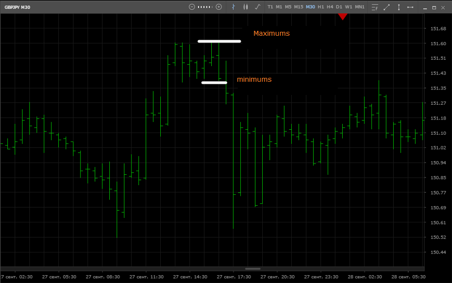
Now we give examples of such patterns and see how they work on different types of graphs. Let's start with a line chart, in the figure - a pattern that speaks of a possible continuation of a downtrend. Each subsequent minimum is lower than the previous minimum, and each subsequent maximum is also lower than the previous one:
Now let's move on to the bars. The figure shows a pattern that may be a harbinger of a trend movement. In two neighboring bars, the maximum is at the same level, however, the minimum of the second bar is lower than the minimum of the first, this suggests that a downward movement can begin, which, however, happens:
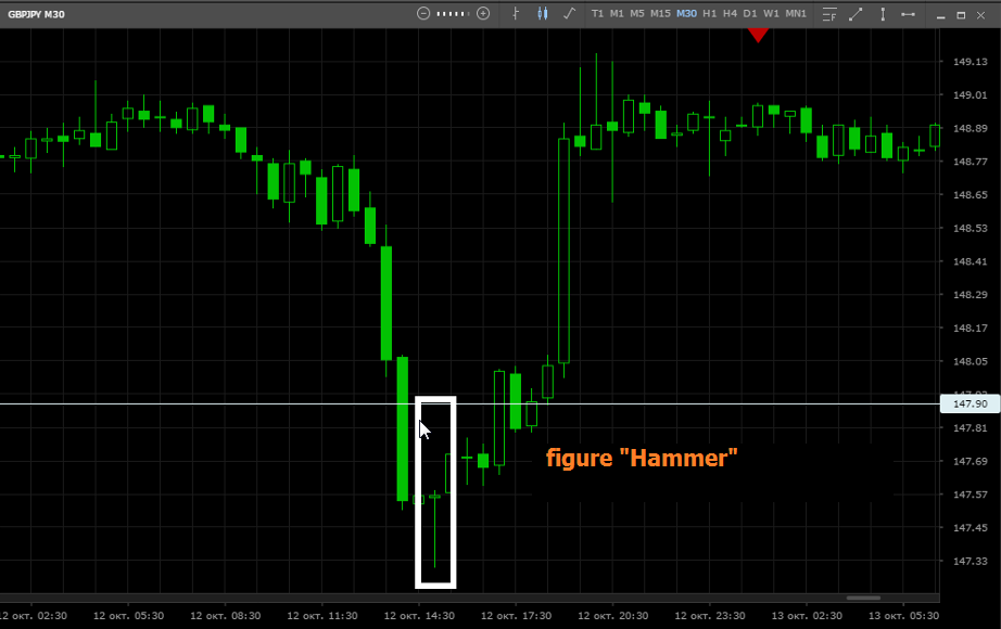
Candlestick analysis is based on patterns that have beautiful proper names and a completely unambiguous interpretation. The following figure shows the “Hammer” figure (a long “shadow” below the short “body”), after which a trend reversal may occur with a certain probability:
Only some examples of chart analysis are described here. Each of the above examples is part of various systems of technical analysis, which will be considered in the relevant articles.
In addition to the price chart itself, traders use various indicators that can calculate statistical data (quotation history) and give tips on the most likely direction of the price, continuation, stop or reversal of the trend.
Important price levels and trend movements
The chart provides a visual understanding that the price is in a certain range, and before the price leaves this channel, the trader can make good money. The chart can be used to identify important levels within which the price moves. The border at the top of the corridor is called the resistance level - within this border, as a rule, there are large orders for sale, and the border below is called the support level, there are buy orders:
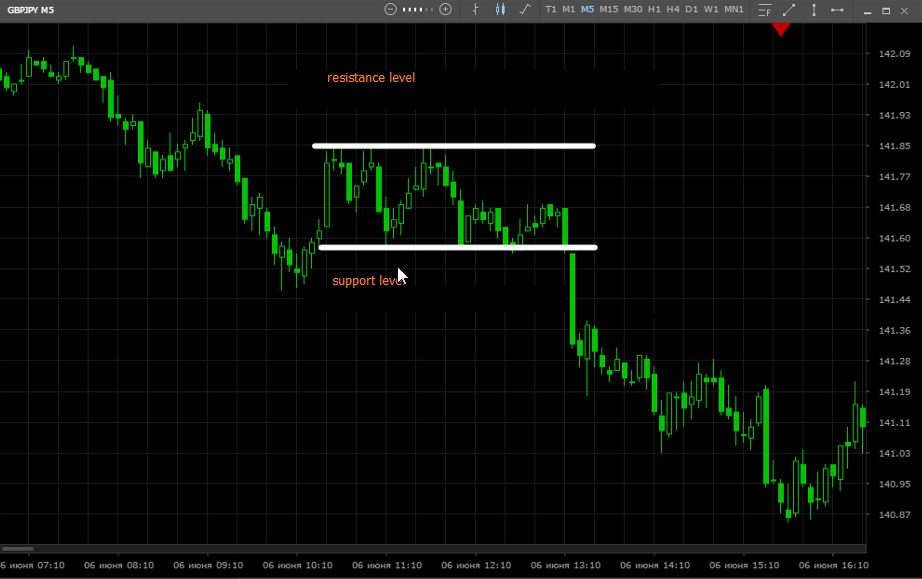
The price may be held within the corridor due to objective economic conditions or simply because most players do not believe that the price will change. If the price does not break through the support and resistance levels for a long time, then traders buy near the lower border and sell at the upper border of the formed range.
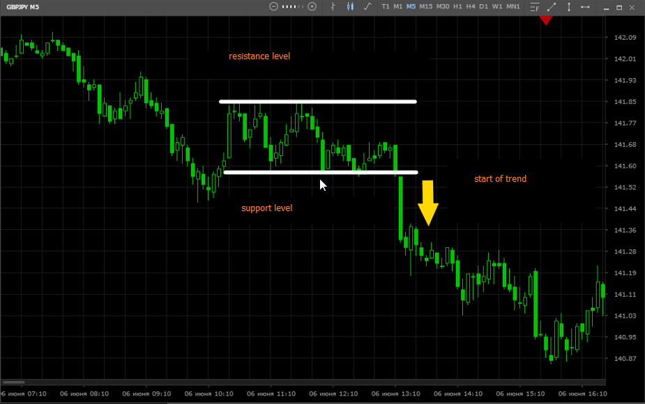
Investors and traders tend to think that a breakdown of a certain level, in which the price is long, may indicate the beginning of a trend:
Conclusion
Of course, none of the existing theories and strategies can offer models whose use would give a one hundred percent result, a lot depends on the skills of the trader. Nevertheless, professional bank traders, large investors working in the long term, along with important economic indicators, are willing to use technical analysis of the chart as a tool that can increase the accuracy of forecasts or find the best time to enter. The price chart is indeed a very useful, if not indispensable forecasting tool.